- Mixed-Methods
- UX Redesign
- Concept Testing
Baidu Netdisk – Redesign Research
Conducted mixed-methods research to address an outdated desktop experience, informing a redesign that shaped a subsequent product refresh.
Company: Baidu·Timeline: July–August 2025·Role: UX Research Intern·XFN: Product & Design
TL;DR
I conducted mixed-methods research to understand why users perceived Baidu Netdisk’s desktop experience as “outdated” and translate that perception into actionable redesign priorities.
Through a survey (N=1,124), 6 in-depth interviews, and a focus group with concept testing, I found that the deeper issue was a lack of simplicity, especially visual overload and interaction complexity.
The research findings informed redesign recommendations that shaped the subsequent product update.
Company and Product
Baidu Netdisk is one of China’s leading cloud storage platforms (similar to Google Drive). During my internship, it was rapidly expanding its AI features for work and learning, such as video summarization, transcription, and PowerPoint creation.
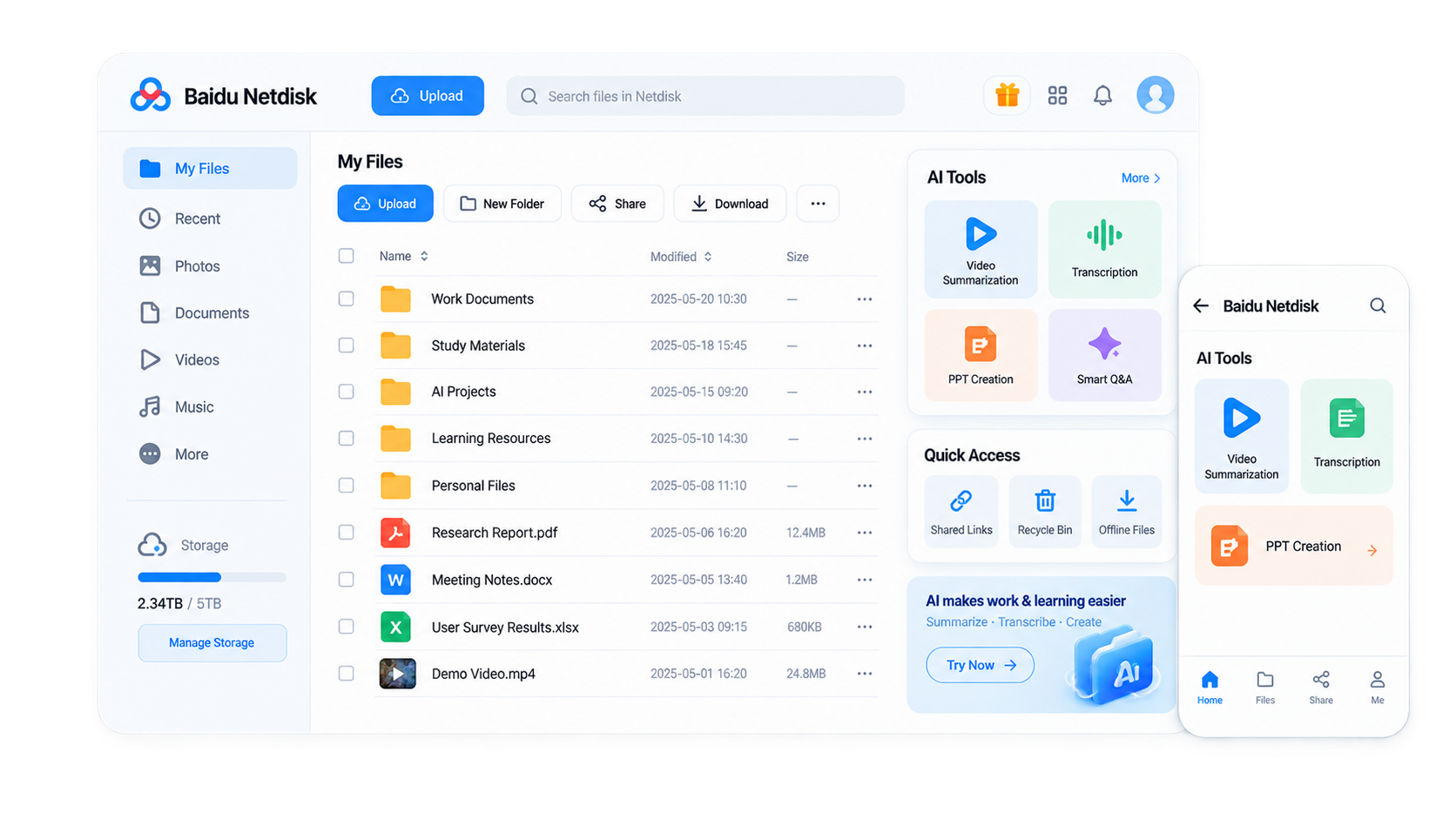
Project Background
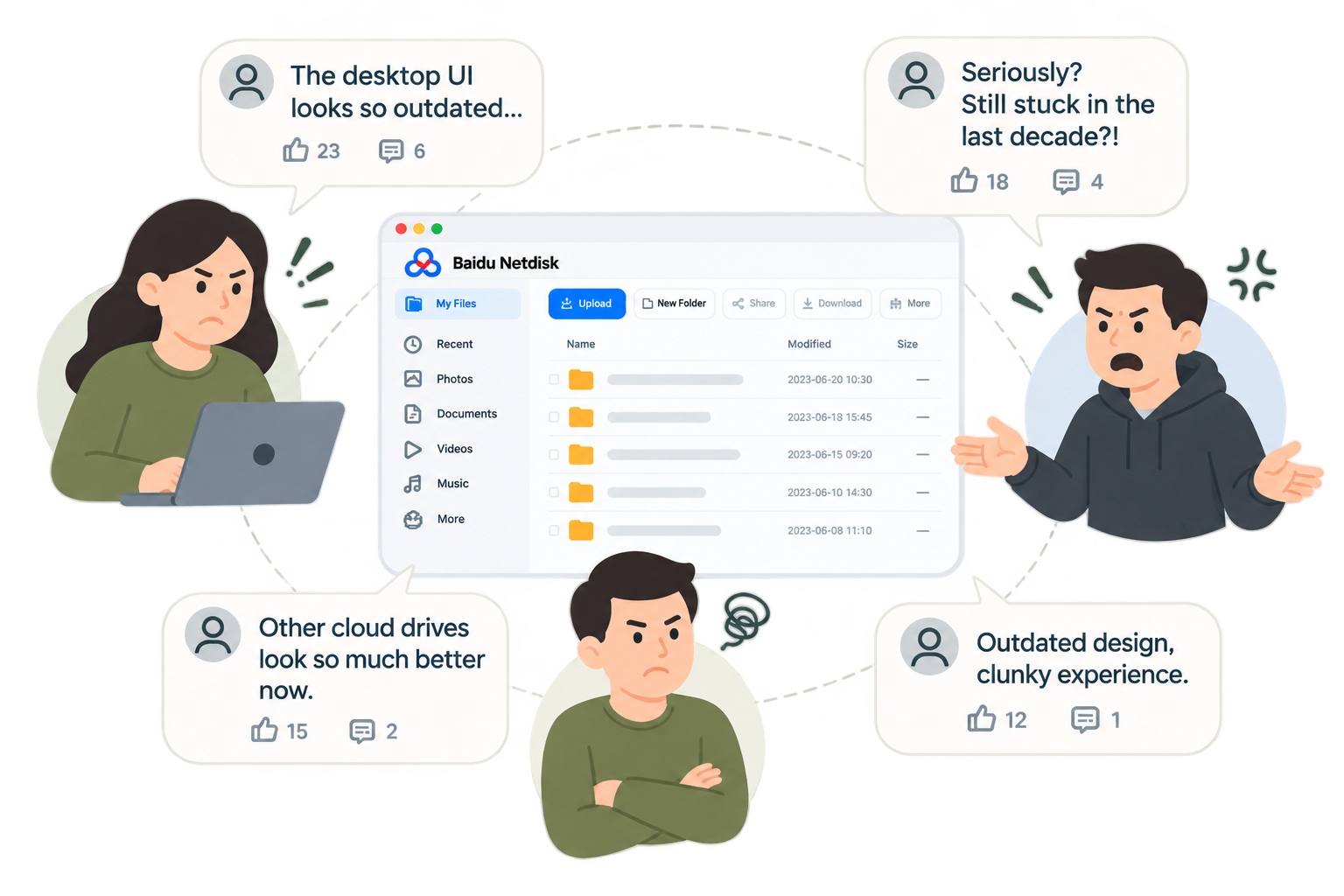
Signal
The Product team observed growing user feedback that Baidu Netdisk’s desktop interface felt outdated.
Why it matters
- Could lead to user attrition in an increasingly competitive market.
- Could hurt new-user acquisition by reinforcing a negative product perception.
- Could hinder Baidu Netdisk’s transition to a more modern toolkit and users’ adoption of its AI features.
Goals and Research Questions
Measure User Perception
Do most users perceive Baidu Netdisk’s desktop interface as “outdated”?
Diagnose the Problems
What does “outdated” really mean?
Guide Redesign Directions
How might we redesign the desktop experience?
Research Design
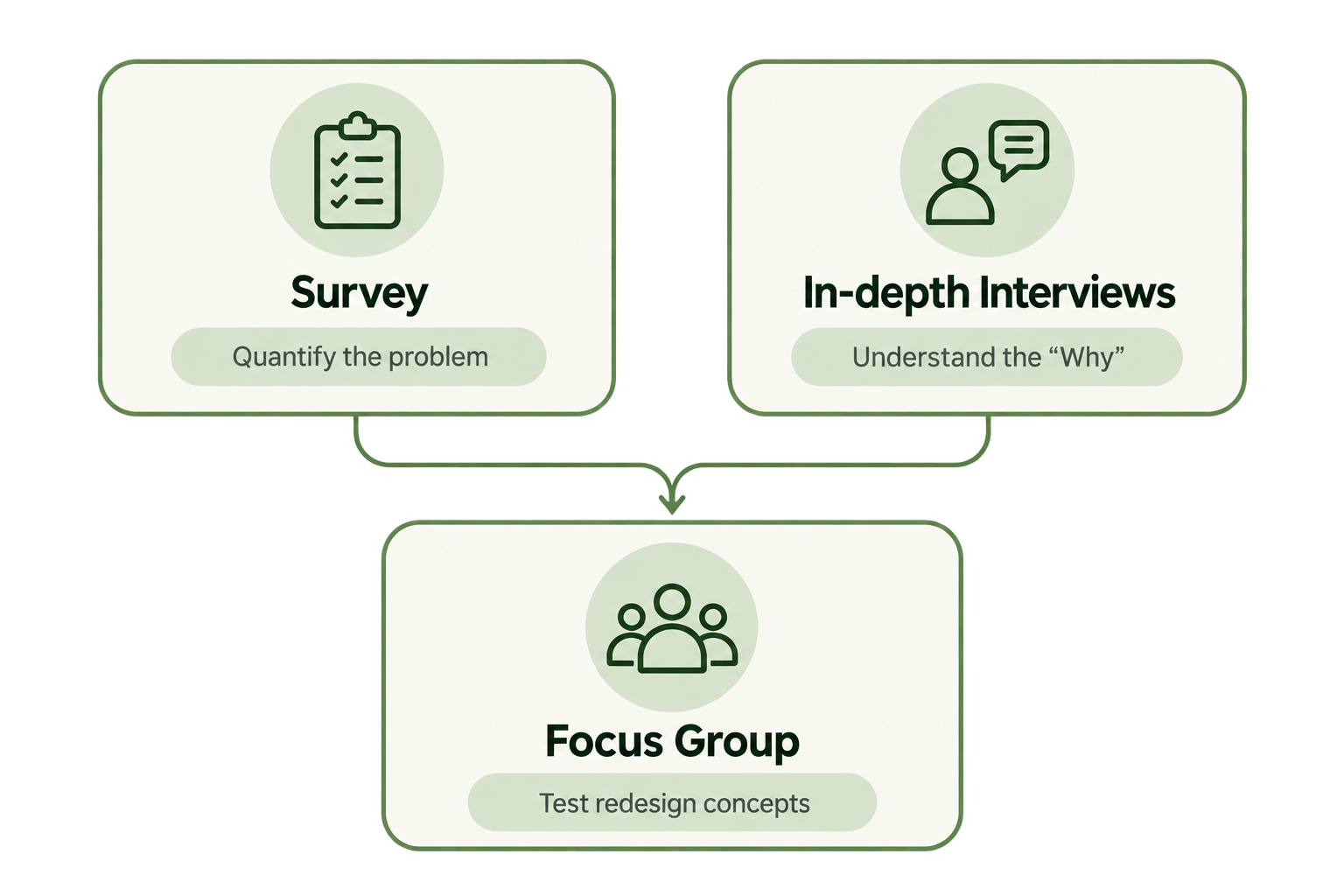
Phase 1 | Quantify the Problem
Method: Survey (N=1,124)
Goal: Measure how strong the “outdated” perception was + identify key pain points
Recruitment: Distributed through Netdisk’s desktop and mobile apps
Phase 2 | Understand the “Why”
Method: 6 in-depth interviews
Goal: Uncover the reasons behind users’ “outdated” perception and key pain points
Recruitment: Partnered with the Customer Service team to recruit 6 users who had previously shared feedback on the desktop interface ↗ See reflection
Phase 3 | Test Redesign Concepts
Method: Focus group
Goal: Capture users’ expectations and preferences + gather more informed feedback from a design perspective
Recruitment: Selected survey respondents who ①rated the desktop interface as “somewhat” or “very outdated” ②with professional or academic backgrounds in design
Research Findings
01 | Perception
Key Takeaway
Most users do not perceive the desktop as outdated.
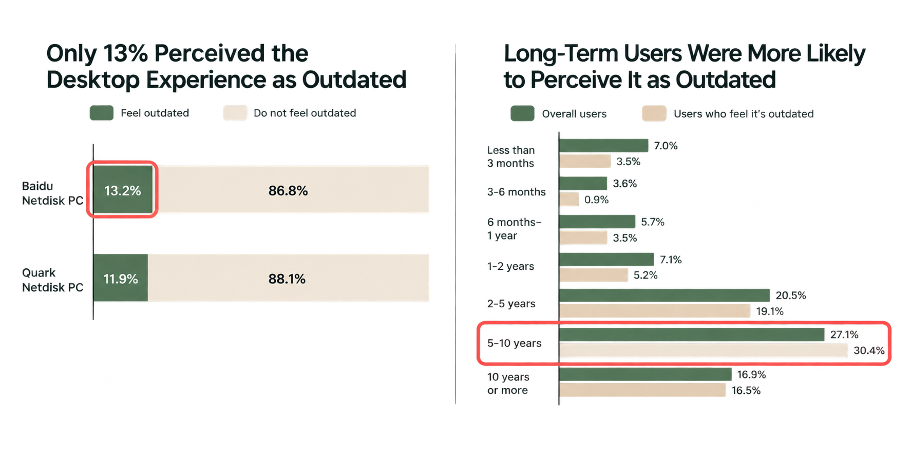
- Hypothesis: Familiarity with the same visual design over time may contribute to the perception of outdatedness.
02 | Problem
Key Takeaway
The biggest problem was a lack of simplicity.
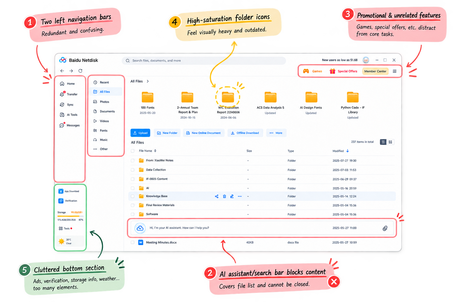
Visual overload and interaction complexity made the experience feel outdated.
03 | Redesign Direction
Key Takeaway
Users wanted a simpler and noticeably refreshed interface.
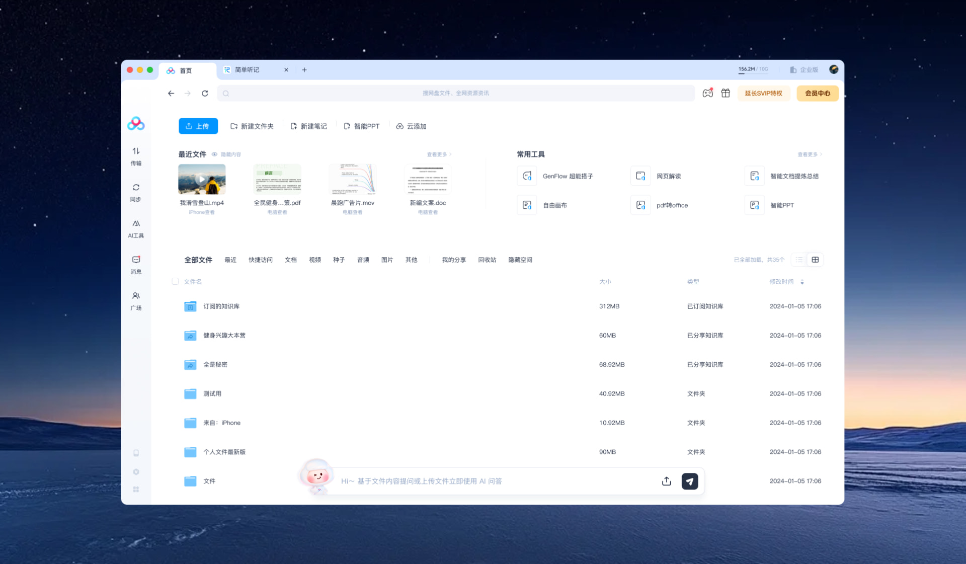
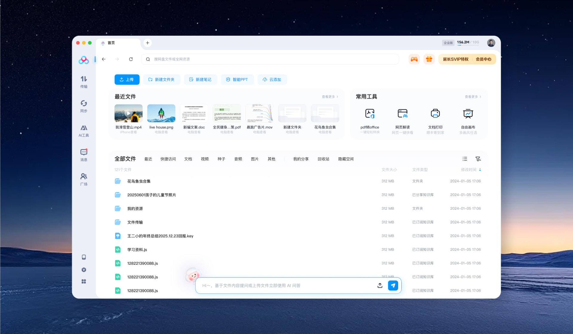
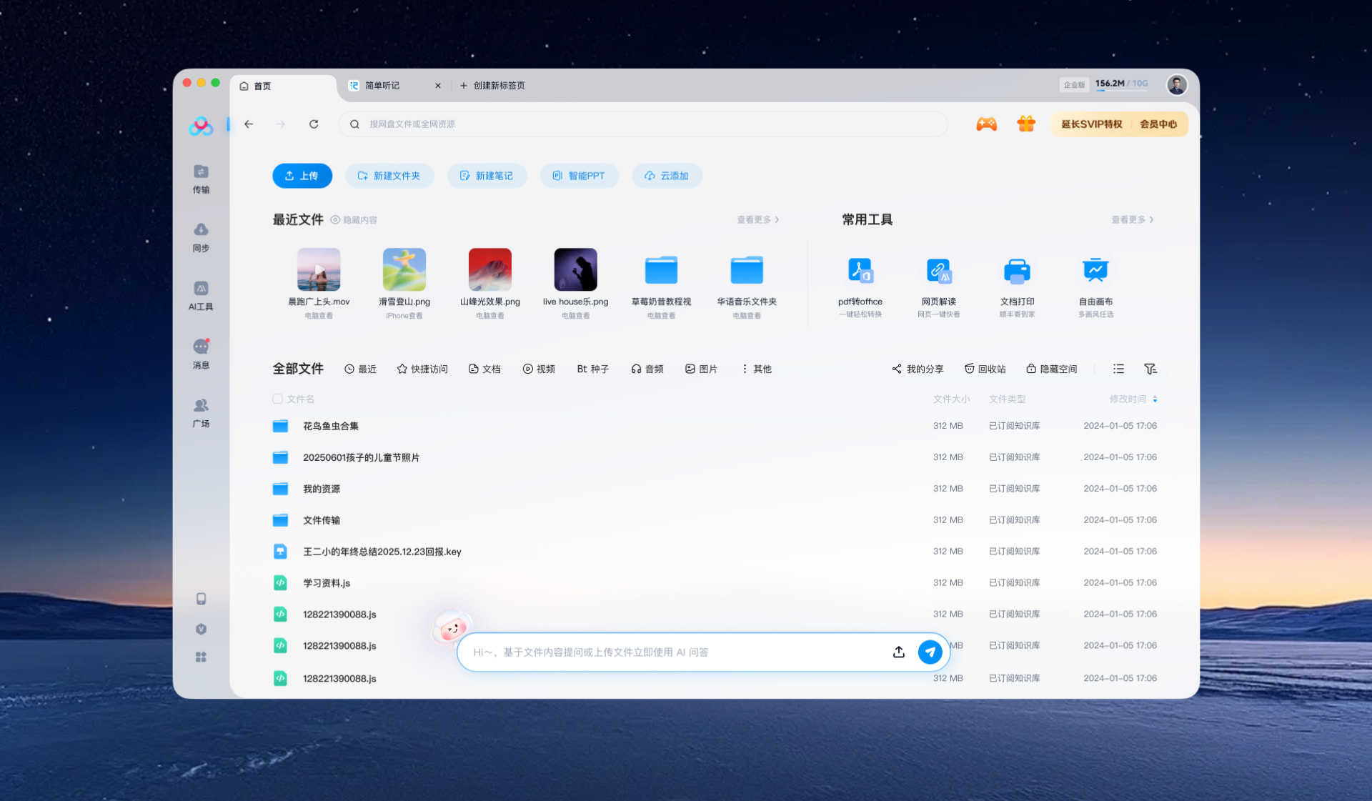
Three concepts explored different visual approaches, particularly in icon styles and layout.
Result and Impact
Turned insights into actionable recommendations
- Paired each recommendation with screenshots/photos of real app examples (user-praised and user-criticized) as concrete visual references
- Organized recommendations into Visual / Interaction / Function for easier implementation.
Subsequent product updates
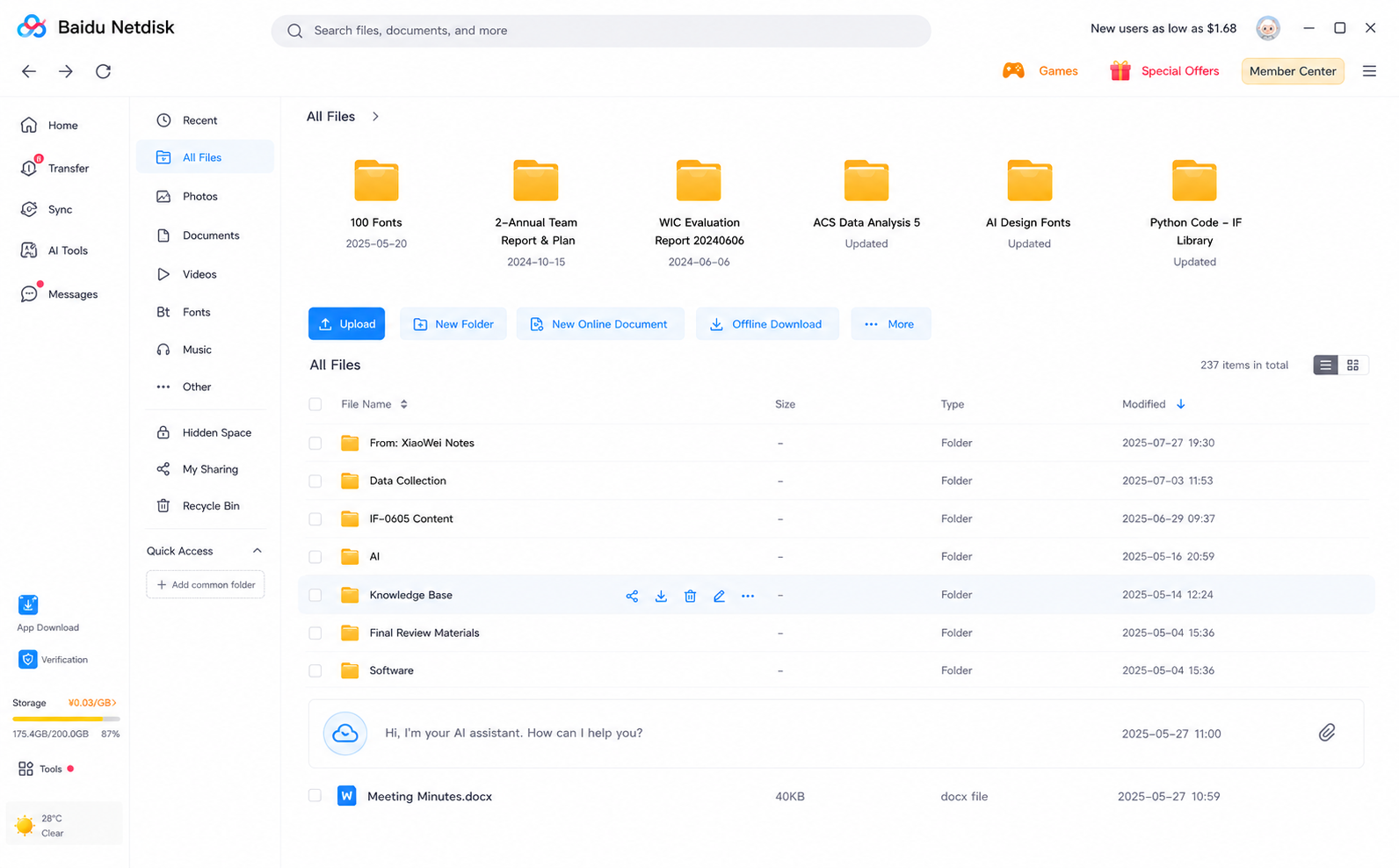
Before
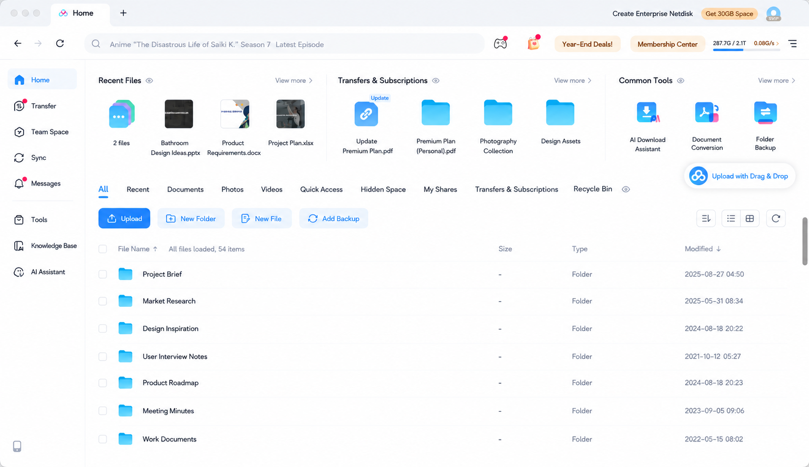
After
Reflection
What worked well?
- The mixed-methods design addressed different questions at each research stage: problem validation, deeper diagnosis, and concept testing.
- Continuous alignment kept PMs and designers engaged throughout the research.
What I would have done differently?
- Improve IDI recruitment
① Recruit based on research goals. Define the desired participant profiles first, then recruit from survey respondents rather than relying on Customer Service referrals.
② Build a more balanced sample. The interview sample skewed male and technical, which may have biased feedback toward functionality and away from visual design.
- How to Interpret Findings
① Be careful about taking users’ quotes at face value.
② Translate findings into clear, actionable language for stakeholders rather than overly academic language.